Wurldtech
Network Protocols Robustness Testing for Critical Systems

Overview
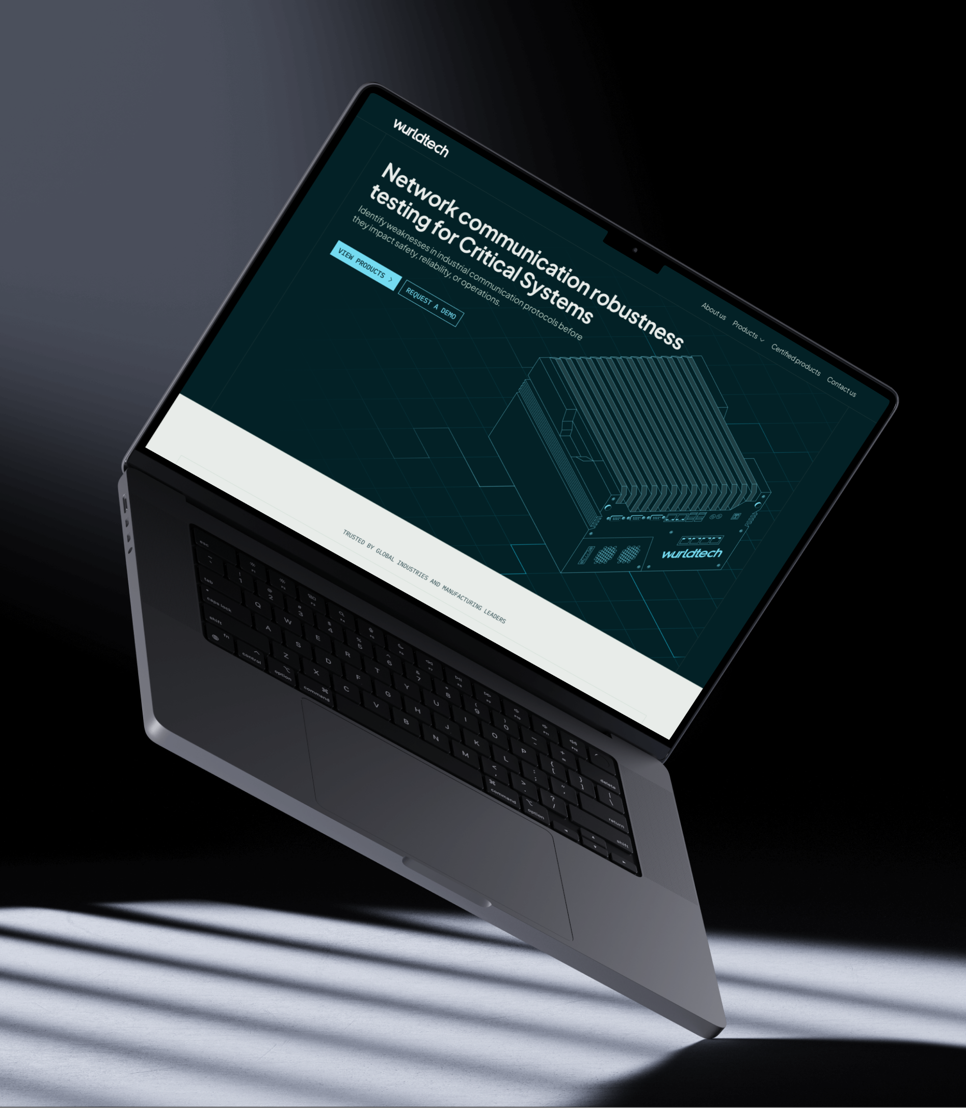
Designing a product-focused website for Wurldtech that brings clarity and structure to complex industrial systems.
| Client | Wurldtech Inc. |
| Industry | Industrial Security / OT Industry |
| Scope | UX Strategy, UI Design, Website Development |

About the Client
Wurldtech Inc.
Wurldtech Inc. focuses on validating the reliability of industrial communication systems through protocol robustness testing and certification solutions.
Its core offerings include the Achilles Test Platform (ATP-4S) and Achilles Communication Certification (ACC), used by industries in critical infrastructure environments.
The Problem
Identifying & reviewing the existing positioning & website
The existing website was unable to clearly communicate Wurldtech Inc.’s role in industrial protocols’ robustness testing, making it difficult for prospects to quickly understand the value of their products.
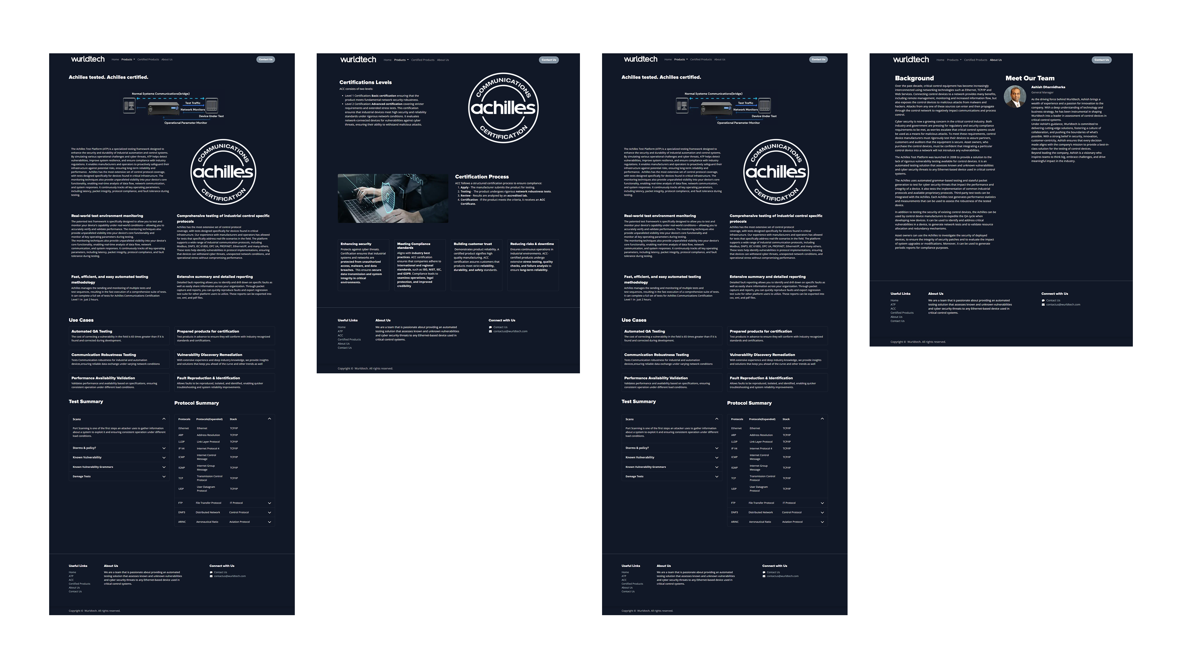
Before
Research & Discovery
Insights gathered from industry patterns, competitors, and user expectations.
To ground the redesign in real context, we focused on understanding how security products are positioned, communicated, and evaluated.
We reviewed various competitors to analyse how protocol testing platforms present their capabilities, depth, and credibility. This helped identify gaps between technical complexity and how it is translated for users.
Stakeholders
From a user perspective, the target audience primarily includes engineers, security professionals, and decision-makers operating in critical infrastructure environments. Their expectations are clear: precision, reliability, and fast access to relevant information without unnecessary abstraction.
Alongside this, stakeholder discussions helped refine positioning, ensuring the website reflects Wurldtech Inc.’s role not just as a product provider, but as a trusted validator of industrial communication protocols' reliability.
Design Strategy
How we approached simplifying complexity through structure, clarity, and system thinking.
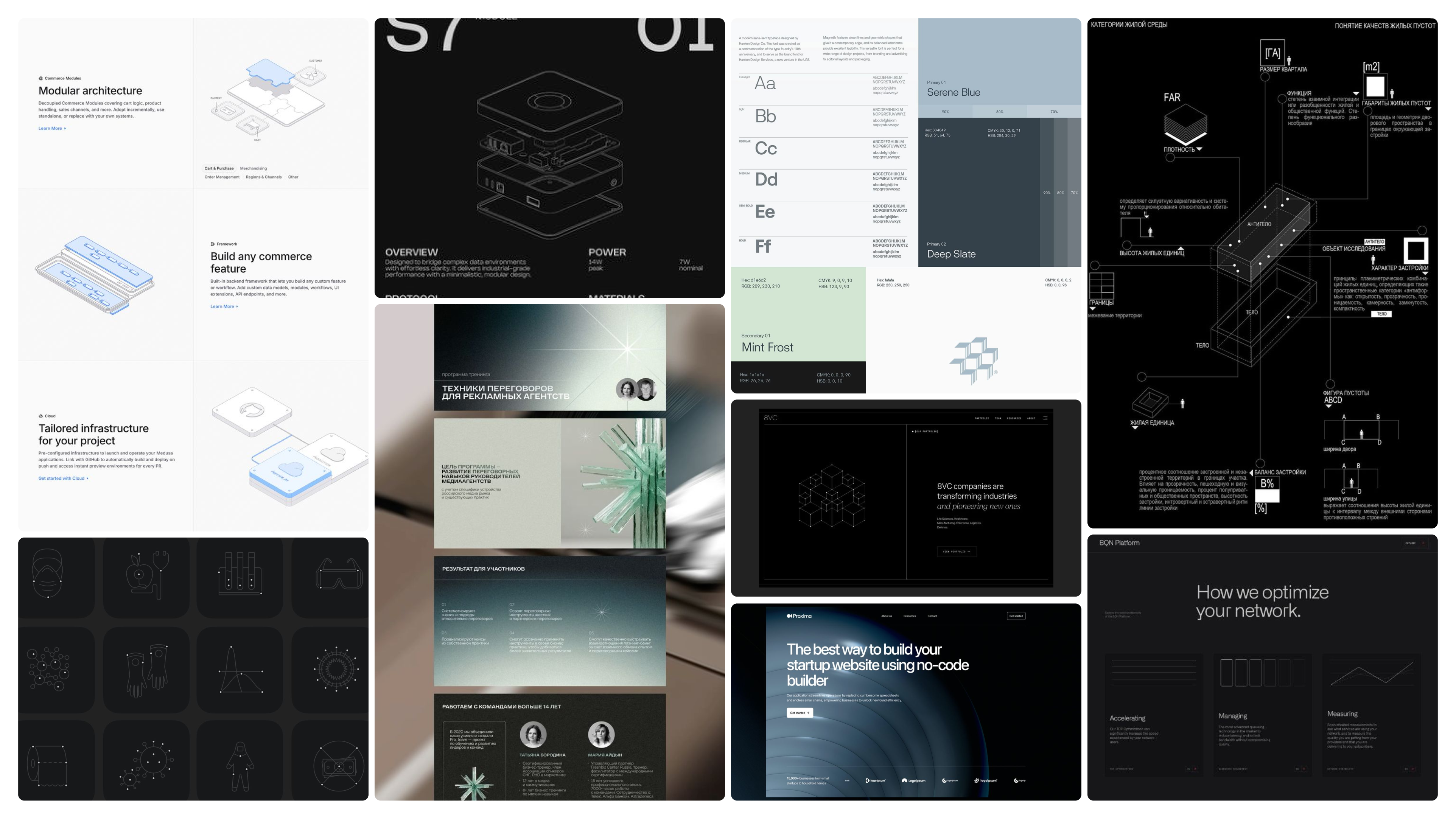
The design approach focused on clarity, structure, and precision, representing the way engineers interact with complex systems.
Instead of storytelling-heavy marketing, the website prioritises product understanding, technical credibility, and direct navigation.
Website Flow
Mapping the user journey from first interaction to final conversion.
The user journey was designed to move from understanding → trust → action, without overwhelming users with technical complexity upfront.
We structured the flow to introduce Wurldtech Inc.’s value clearly, then progressively expose product depth only when the user is ready to explore further.
Conversion Strategy
- Entry (Homepage ): Users are introduced to the core idea of protocol robustness and why it matters, with a strong product-first narrative.
- Understanding the Product (ATP / ACC Pages): Clear breakdown of capabilities, testing methods, and outcomes. Focus is on how it works rather than just what it is.
- Validation & Trust (FAQ, Certifications, Content Blocks): FAQs and structured explanations help answer technical doubts and reduce friction in decision-making.
- Action (Request a Demo / Contact): Contextual CTAs placed across the journey allow users to convert once they reach clarity, instead of forcing early action.
The flow was intentionally designed to match how engineers evaluate systems: understand, validate, and then act.
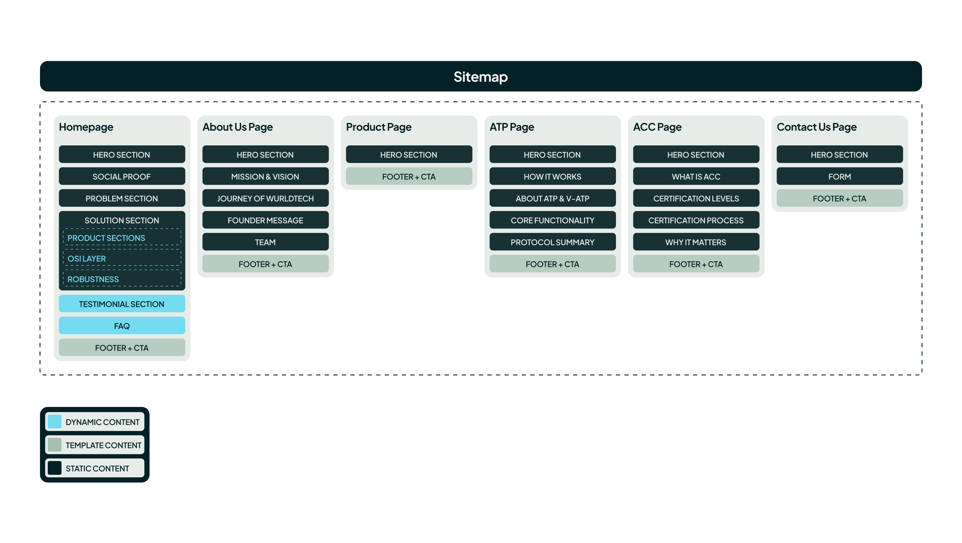
sitemap
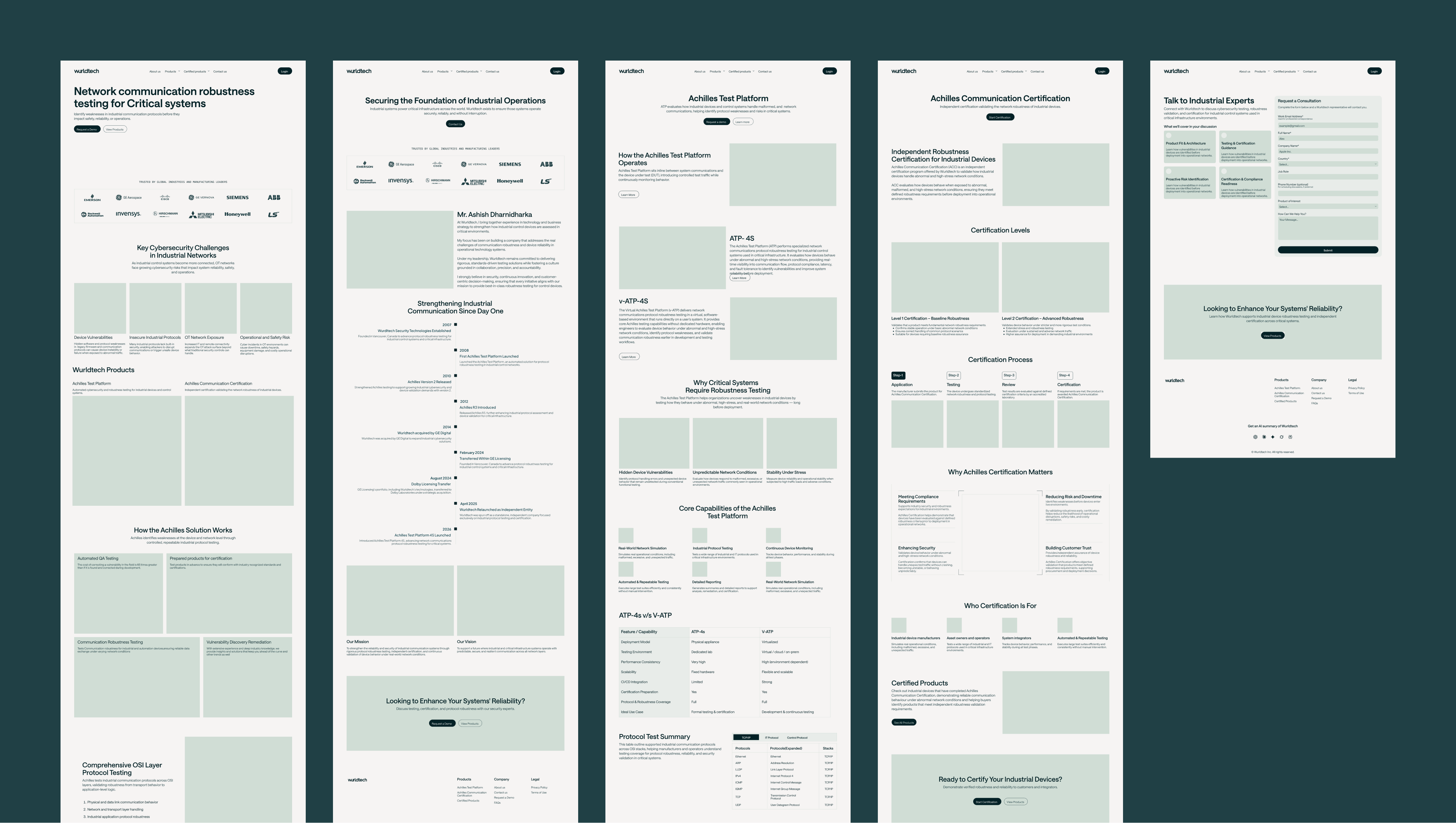
low fidelity design
Visual Design
Building a cohesive visual system that reflects precision, reliability, and clarity.
The visual system was built to reflect precision, clarity, and technical reliability, aligning with how critical industrial systems are perceived.
Every design decision focused on reducing noise while maintaining a strong, credible presence.
Color Palette
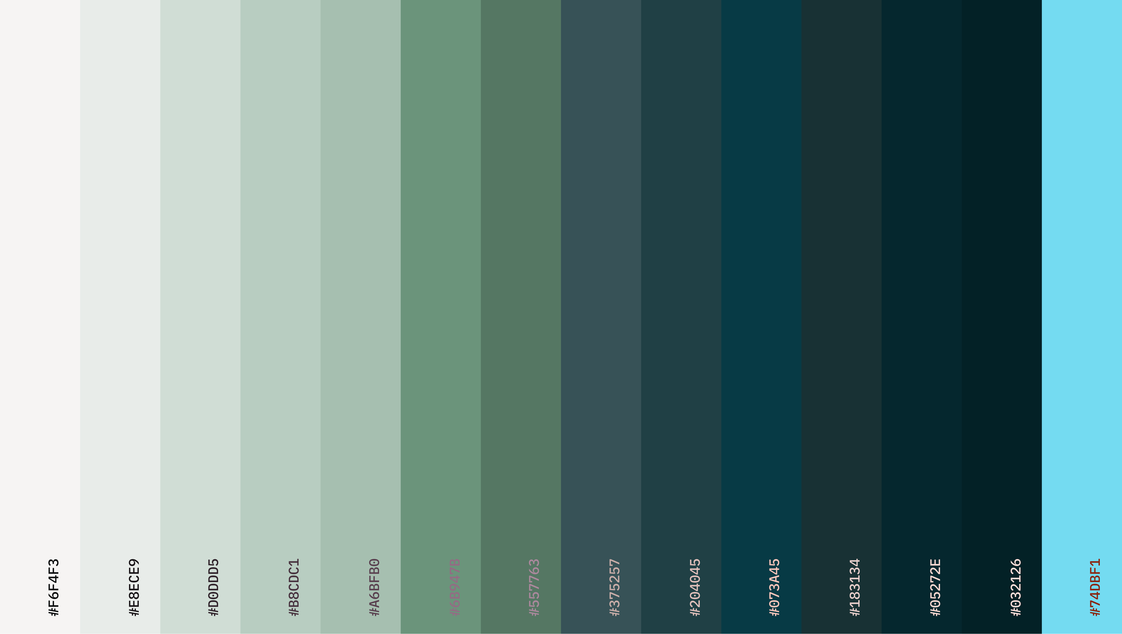
We kept the base intentionally dark. It creates focus, almost like you’re working inside a system rather than browsing a website.
Instead of adding multiple accent colors, we stayed disciplined with teal. It shows up only where it needs to, actions, highlights, key moments. Over time, it becomes a visual cue users can rely on without thinking.
Typography
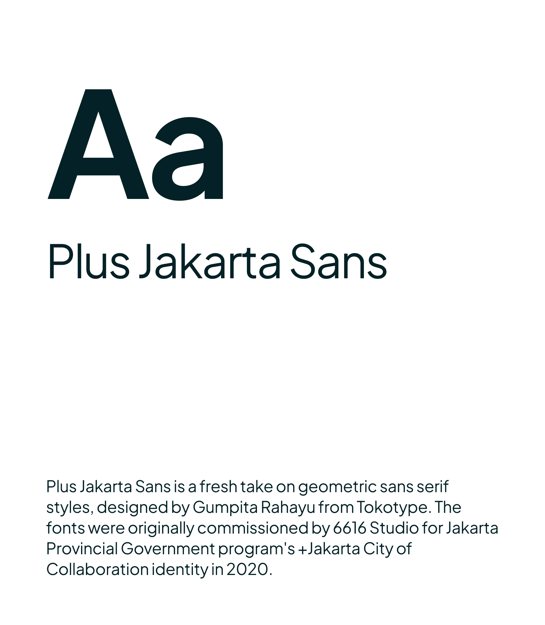
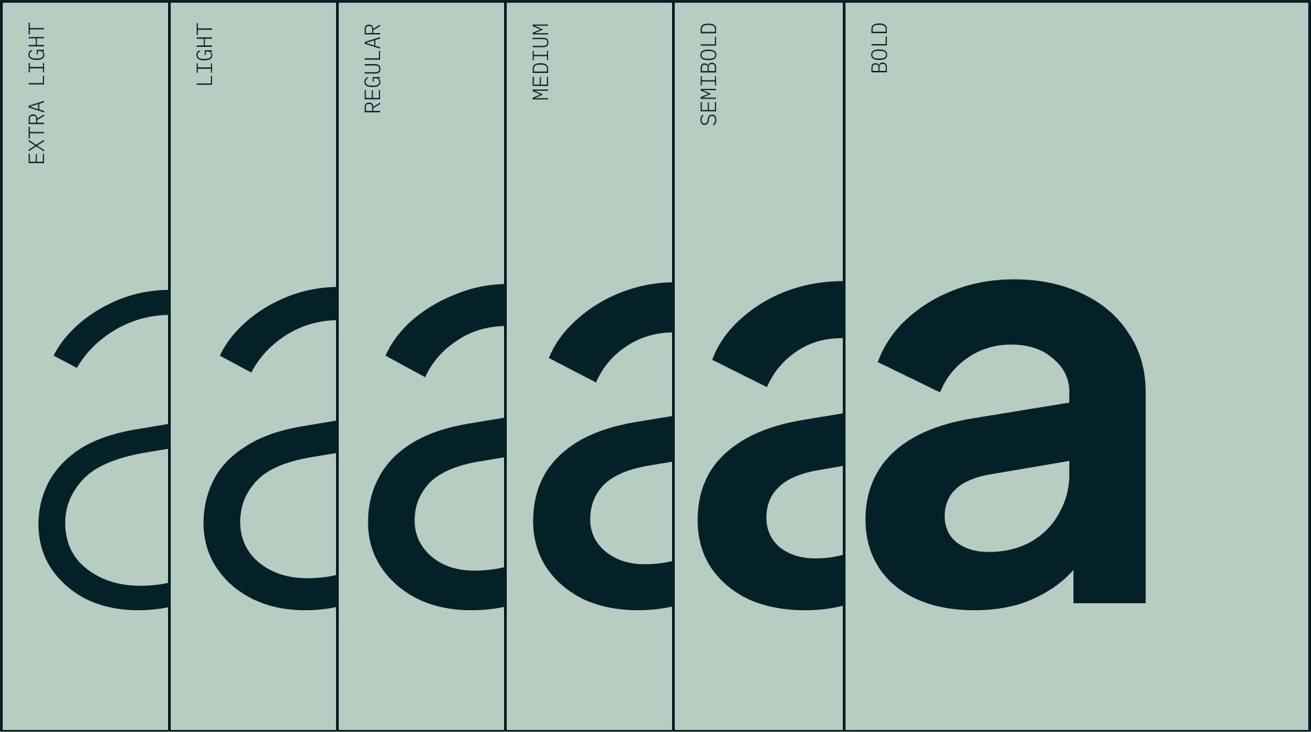
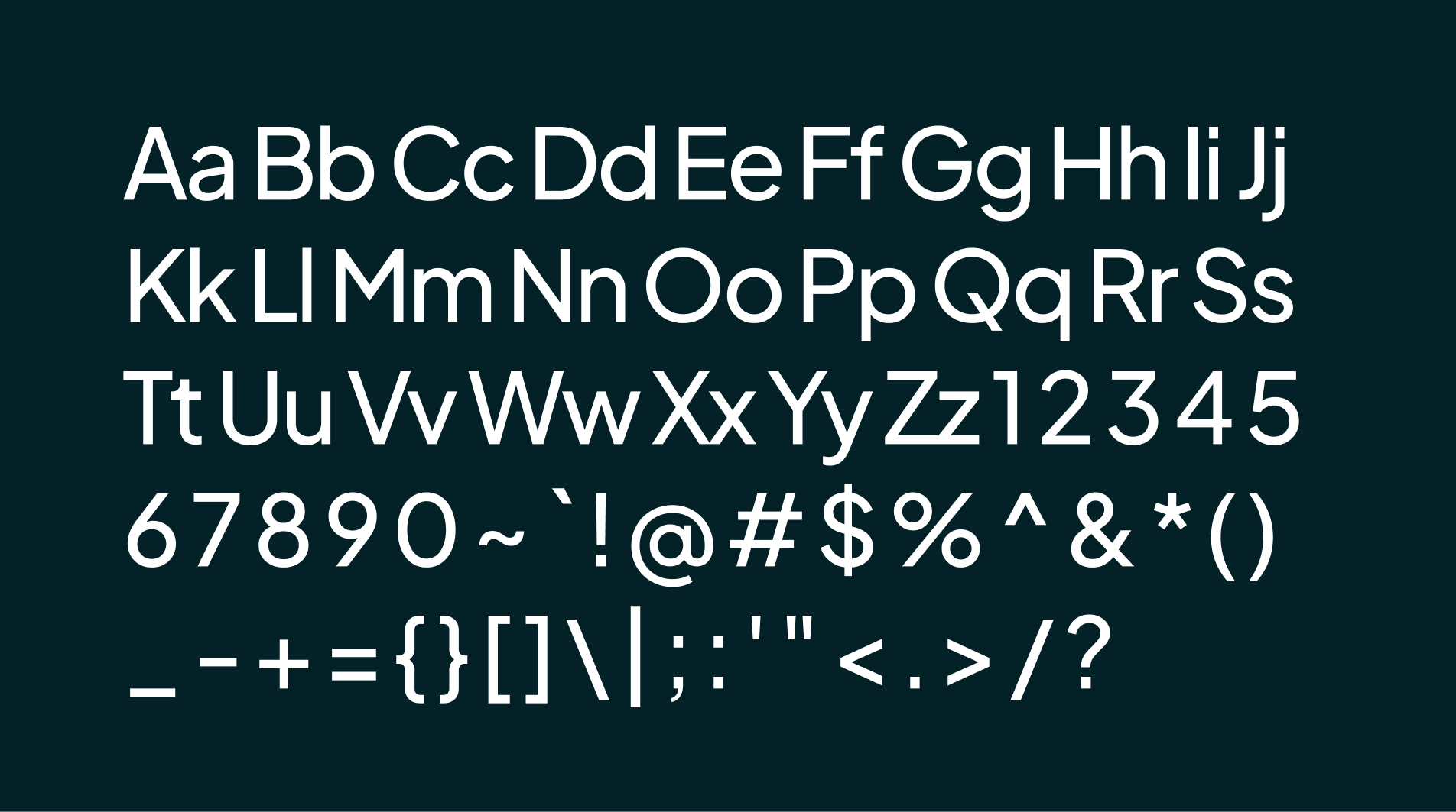
The content here isn’t light. It’s technical, layered, and often dense. So typography had to do a lot of heavy lifting.
We leaned into clarity over personality. Headings will guide you, body text stays readable, and everything is spaced just enough to let you scan before you commit to reading.
The idea was simple: even if you don’t read everything, you should still understand enough.
Interface Modules
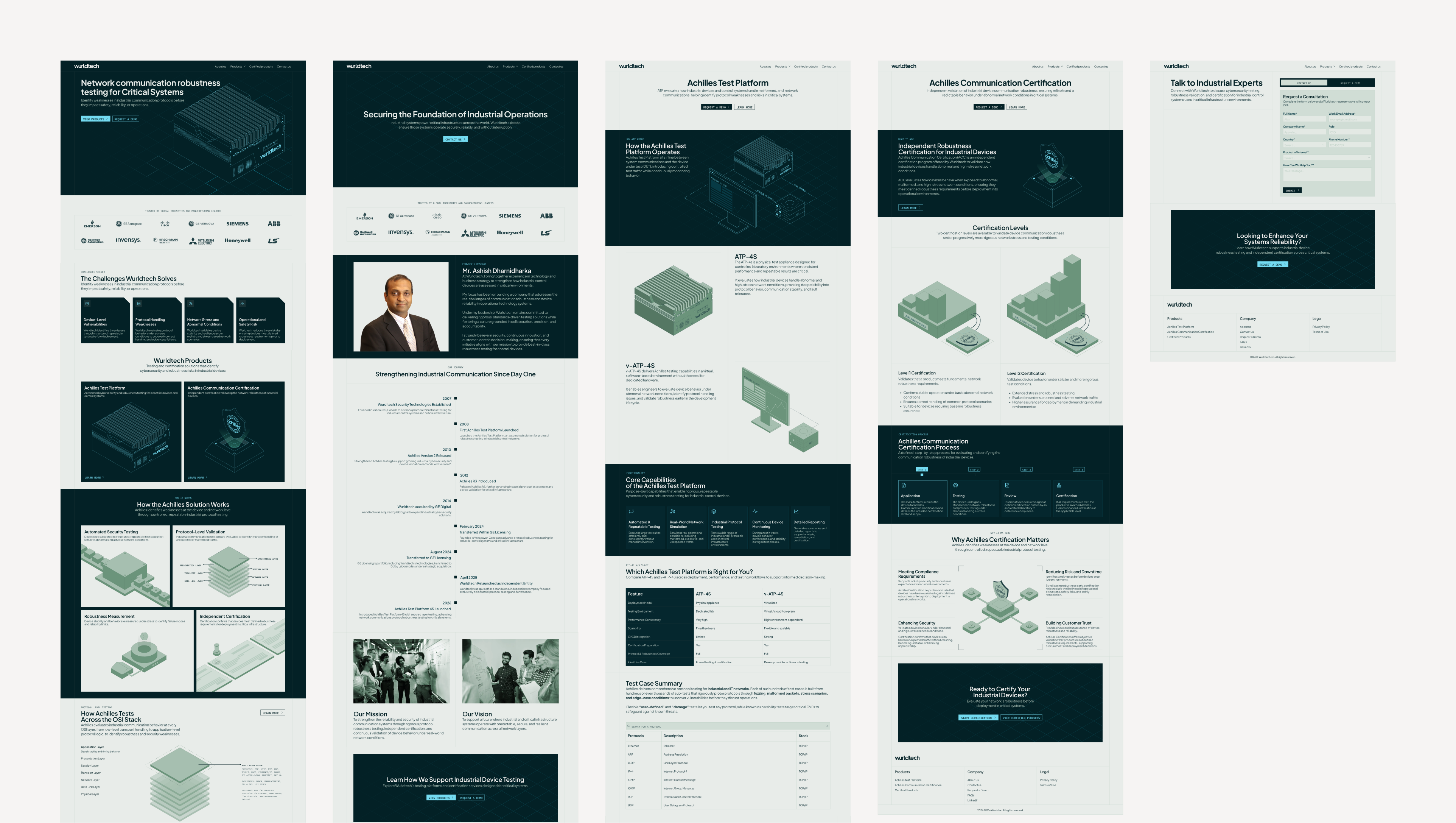
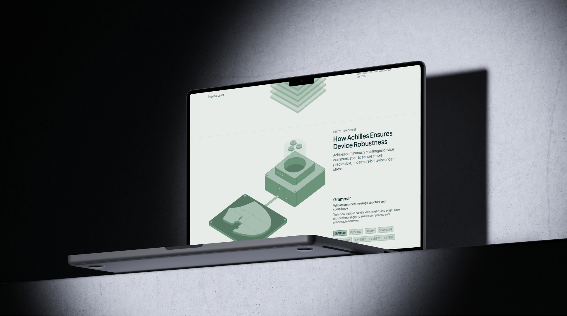
Rather than long scrolling pages filled with mixed content, we broke everything into modules.
Each section has a clear role. One explains, one visualises, one validates, one converts.
This made it easier to control how information is revealed. You’re not forced to understand everything at once. You move through it step by step.
And that mirrors how people actually evaluate complex systems.
ui components
high fidelity design
Illustrations
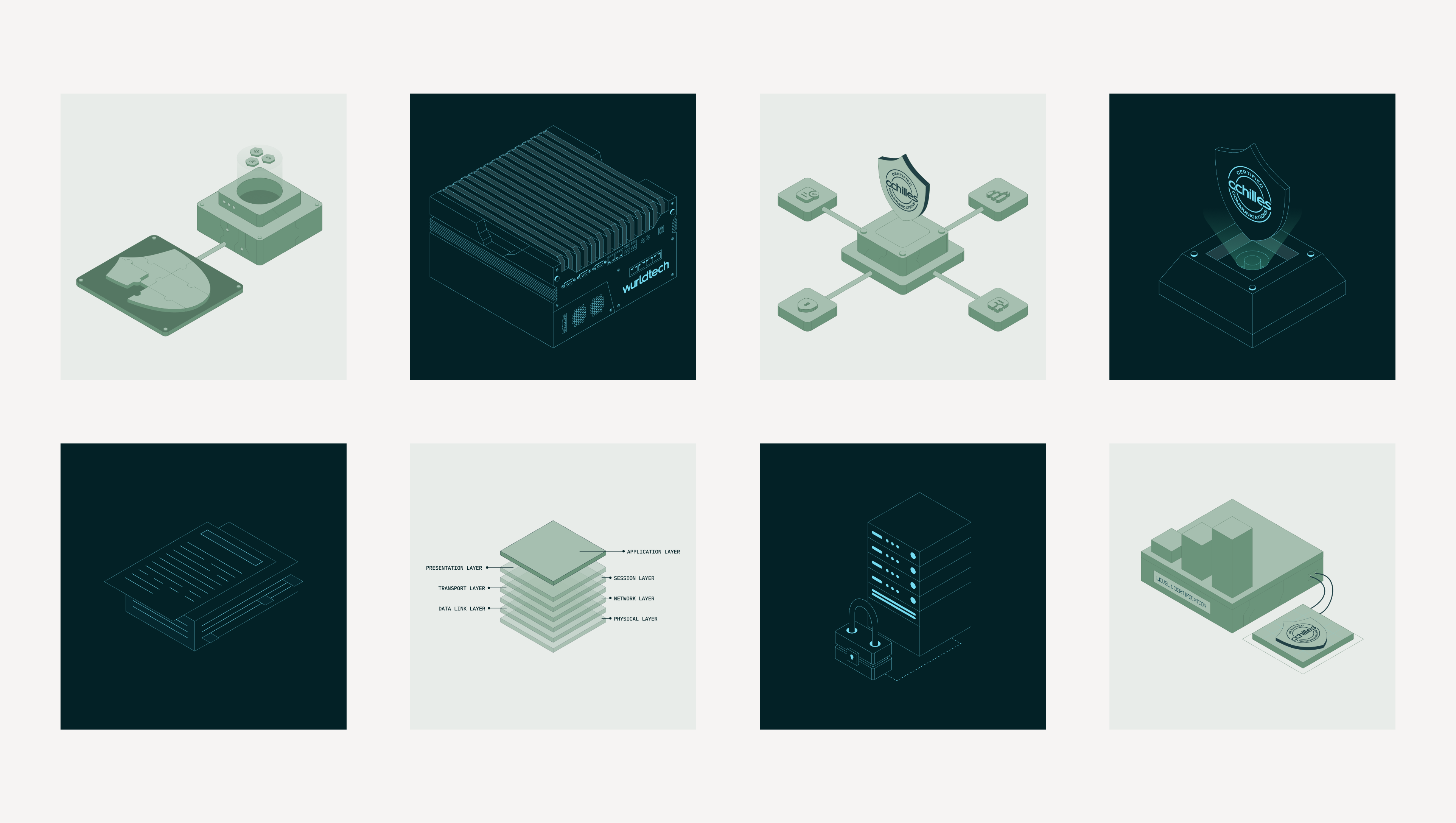
We quickly realised that words alone wouldn’t be enough.
The product deals with systems, layers, communication flows, things that are hard to grasp unless you can see them.
So instead of relying on generic icons, we built a custom illustration system that explains as much as it decorates.
Illustrations
ATP-4S
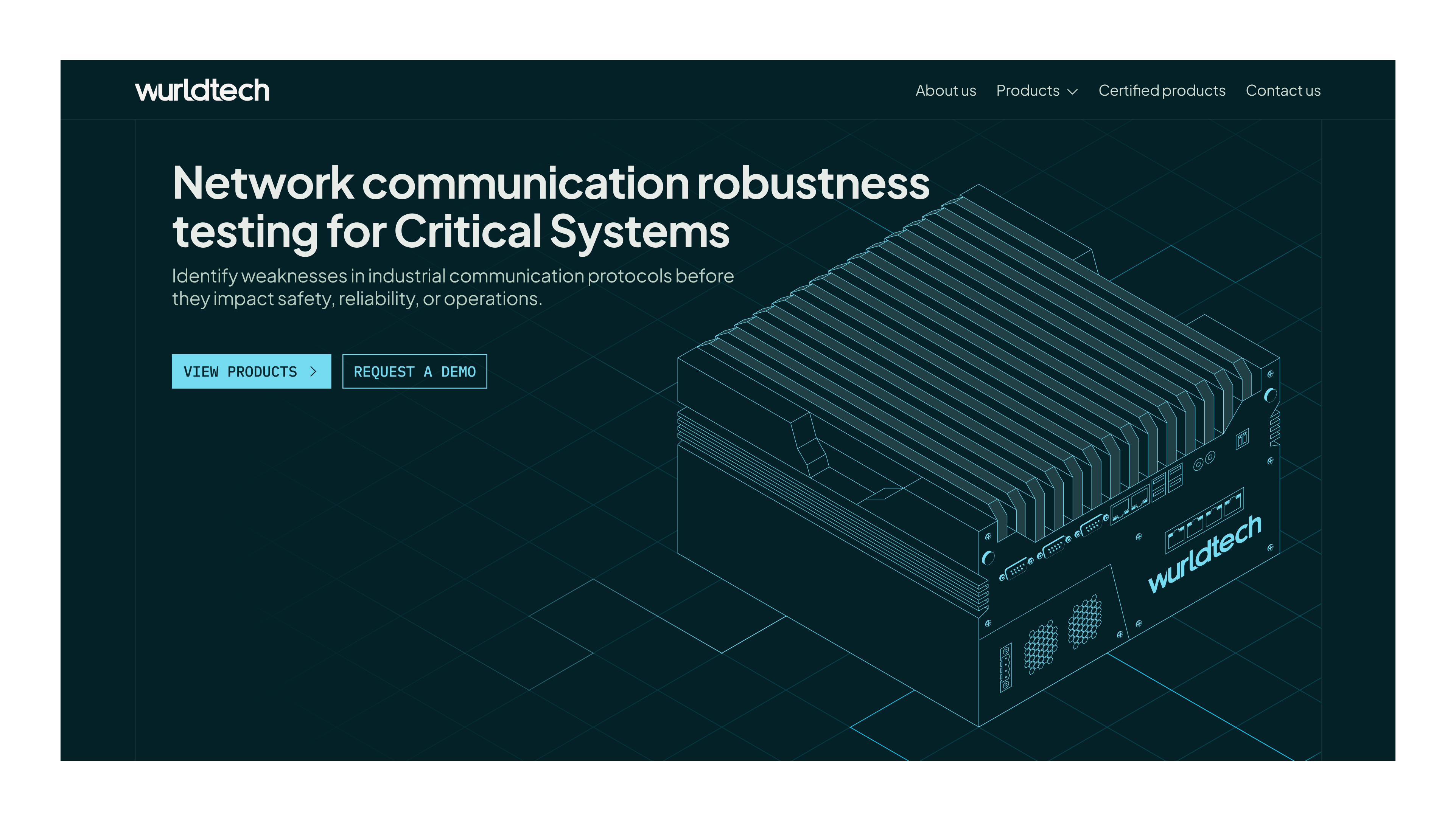
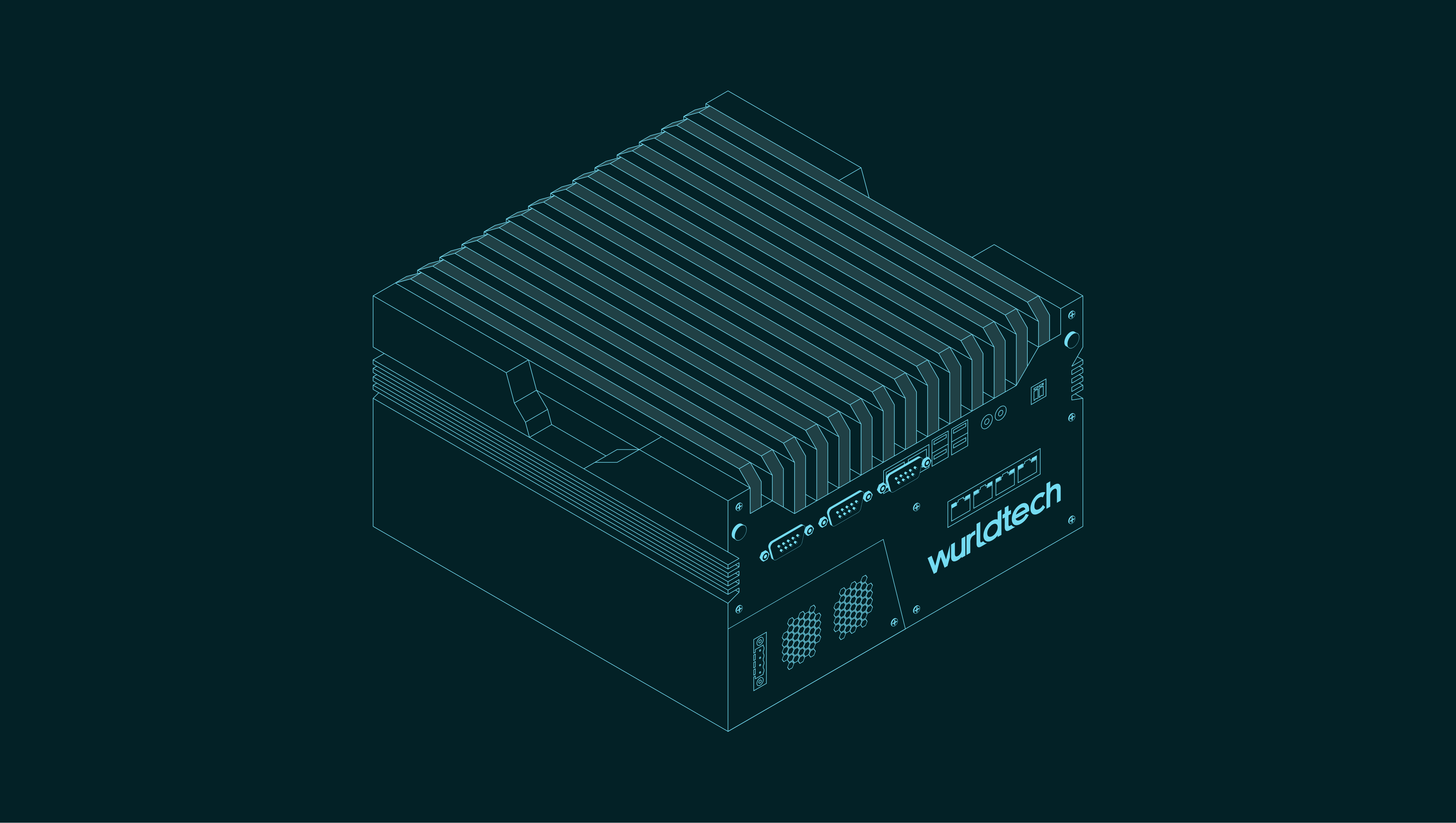
At the core of the visuals is the device itself, the ATP-4S. We treated it almost like a product hero.
Not just a static image, but something that appears across the site in different contexts, connected to systems, interacting with layers, sitting within workflows.
ATP Illustration
Reflection
What worked well, what we learned, and what we would improve further.
Looking back, this project was less about redesigning a website and more about translating complexity into clarity.
One of the things that worked well was the shift to a product-first narrative. Instead of talking around the product, the website now leads with it, making it easier for users to understand what Wurldtech Inc. does.
The modular approach also held up well. Breaking the experience into structured sections helped us manage dense information without overwhelming the user. It gave us flexibility while keeping everything consistent.
What It Was Like Working Together
Hear about the experience with Apexia Labs from their side of the table!

Testimonial
The team understood our product deeply and translated it into a clear, structured digital experience. The outcome feels aligned with how we think about systems and engineering.
Mr. Ashish Dharnidharka, CEO of Wurldtech Inc.
Let's Build Together
If you're building in a space where the business is complex, technical, or difficult to explain, that's where we play the game.We focus on turning businesses, processes, and dense ideas into structured, credible experiences that people can actually understand.
Request access to build your edge